Meritmind
Unifying redesign
Challenge
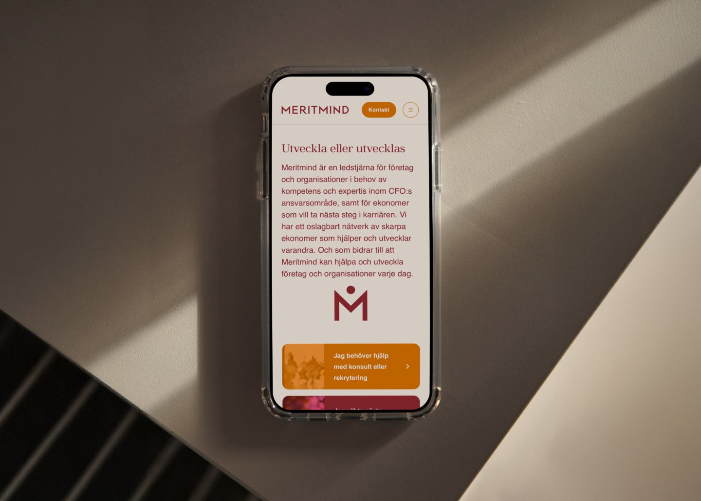
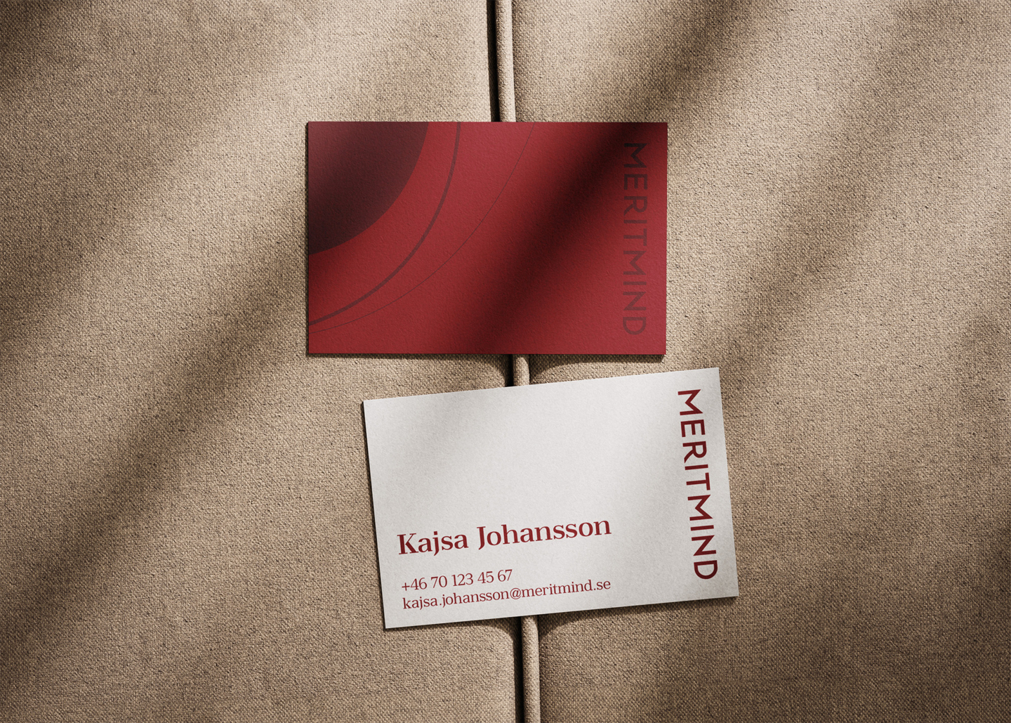
Meritmind is a financial consultancy who supports and guides large corporations every day. The logo has remained untouched since the company was founded over 20 years ago. While well-established it was time give the logo an update and optimize it for the years to come. In short, redesign and modernize without jeopardizing recognition.
Solution
The red color palette was refined, introducing a muted red and a darker variant. The wordmark remained uppercase but was completely redesigned for a bolder, more human look. A new symbol, built from simple geometry, features a centered dot and an “M” from the wordmark, conveying stability and unity — resembling two figures in a handshake. The logo and symbol work together or separately as part of a broader brand refresh.
Idea & Production
Strategy
Activated areas of expertise
Strategy
Identity
Guidelines
Visual Identity
Typography
Want to learn more?
Contact:
Corinne Appelgren